Clearer navigation
Visitors can more easily locate program, admissions, funding, leadership, contact, and donation information.
A digital restructuring project that helped Rising Builders strengthen its organizational presence, clarify its workforce-development programs, communicate funding pathways, and create a more accessible experience for prospective students.
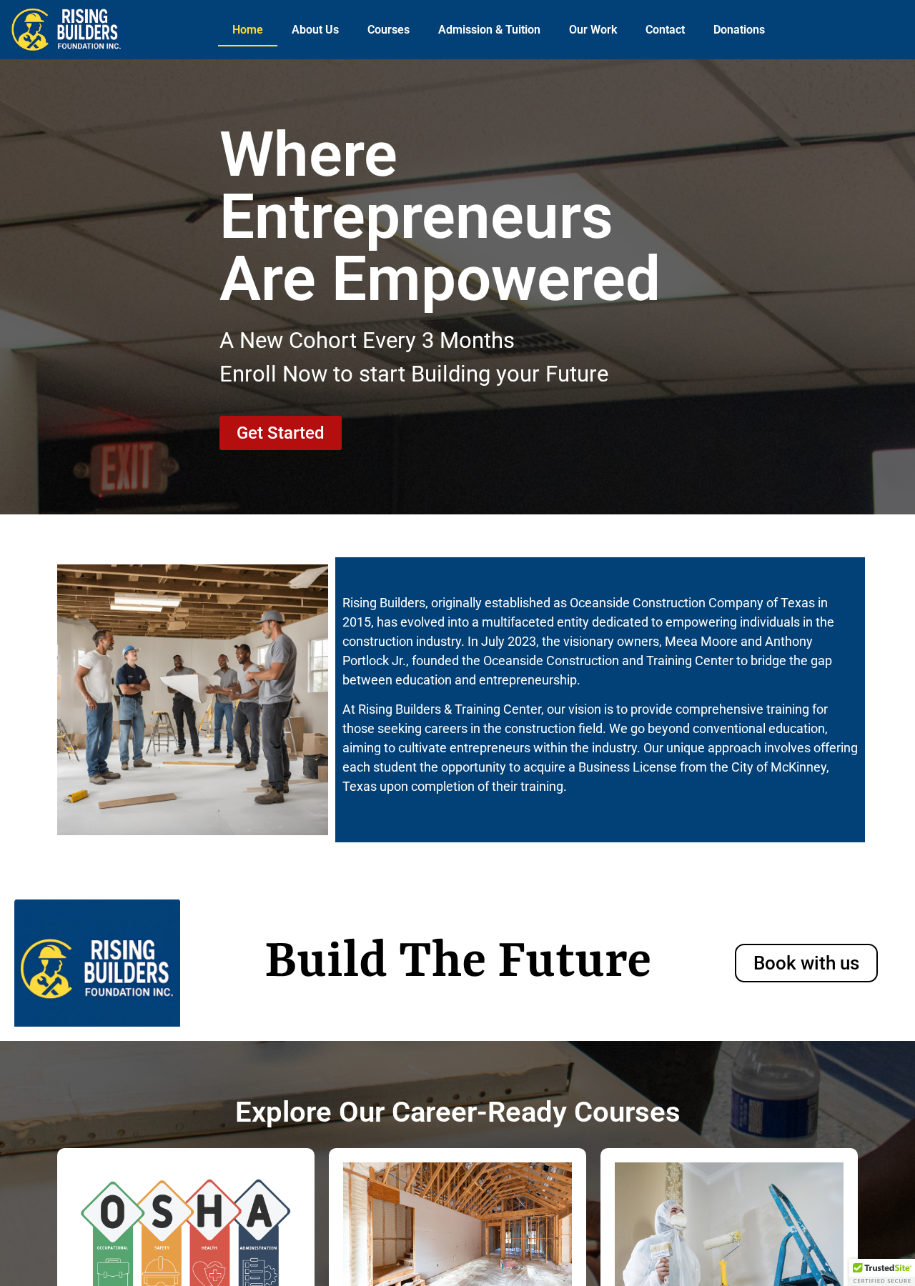
Rising Builders Foundation is a McKinney-based nonprofit focused on skilled-trades education, workforce development, mentorship, and career preparation. The organization helps individuals build practical skills, earn industry-recognized credentials, and create pathways toward sustainable careers in construction and the skilled trades.
The existing website contained valuable information, but its structure and presentation made it difficult for visitors to understand the organization, explore its training program, and identify the appropriate next step. Rising Builders needed clearer navigation, stronger messaging, improved mobile layouts, correctly organized About and Contact content, more accessible admissions and funding information, updated leadership content, and a visible pathway for donations.
I led the website audit, restructuring, mobile optimization, content organization, copy refinement, and Elementor layout improvements. I also helped shape the admissions, funding, leadership, contact, and donation experiences while working within the organization's existing WordPress website.
The website had structural, visual, and content issues that affected clarity and usability, especially on mobile devices. Important information appeared on the wrong pages, images and sections did not scale consistently, and overlapping elements disrupted the mobile experience. The organization's mission, programs, admissions process, funding options, leadership, and community impact also needed a clearer presentation.
Rather than rebuilding the website from the ground up, the project required improving the existing WordPress and Elementor site while preserving its core content and functionality.
I restructured the website around the information visitors need most. Navigation and page content were reorganized, mobile layouts were corrected, imagery and spacing were refined, and the organization's messaging was rewritten for prospective students, families, partners, sponsors, and donors. I also created clearer admissions and funding pathways, improved the contact experience, updated leadership content, and integrated Zeffy into a more visible donation section.
I handled the audit, restructuring, mobile corrections, and content work needed to turn the existing site into a clearer experience for every visitor.
I worked in prioritized stages inside the existing WordPress and Elementor site, improving structure, mobile presentation, and content before a final review.
Reviewed the website structure, mobile experience, content placement, navigation, and visual inconsistencies.
Worked with the Rising Builders team to identify the most important visitor needs and website corrections.
Reorganized navigation, page content, imagery, calls to action, admissions information, and funding content within WordPress and Elementor.
Corrected hero sections, image ratios, spacing, overlapping elements, and readability issues across smaller screens.
Refined organizational copy, updated leadership information, improved forms, and integrated Zeffy into the donation experience.
Tested the completed website across desktop and mobile layouts and refined the remaining presentation and usability issues.
A closer look at the website I designed for Rising Builders.
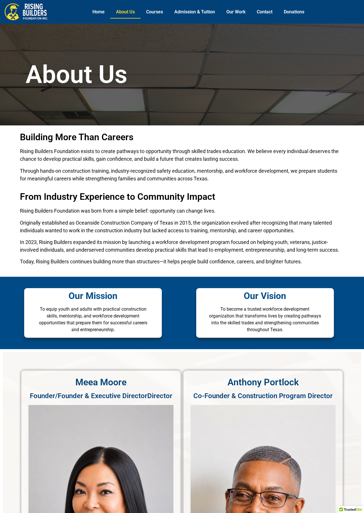
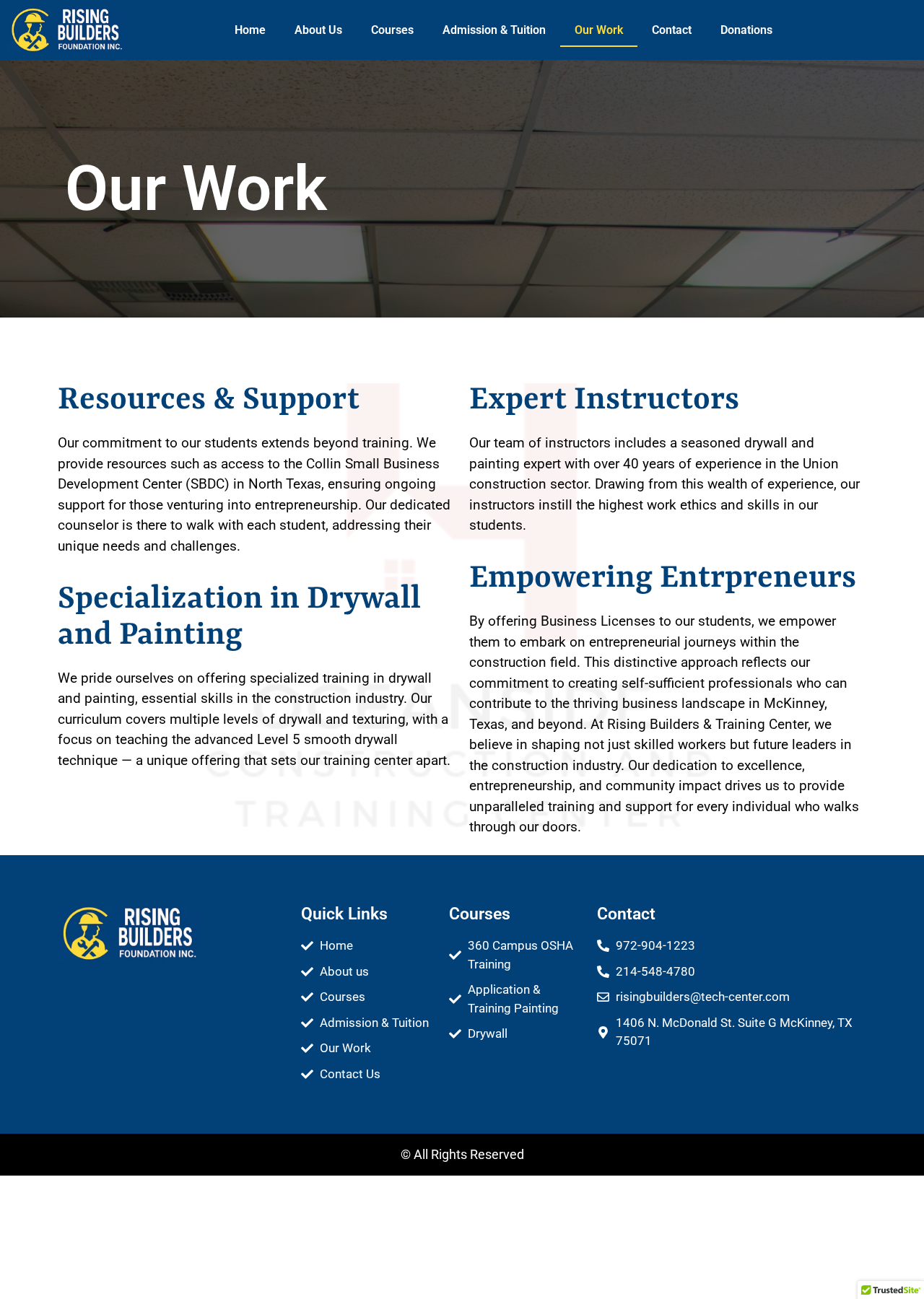
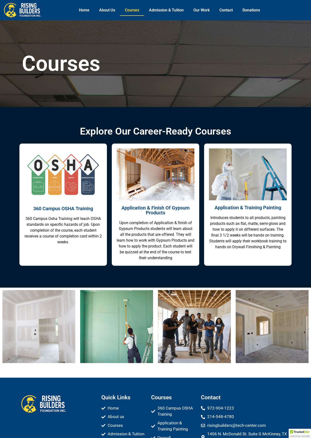
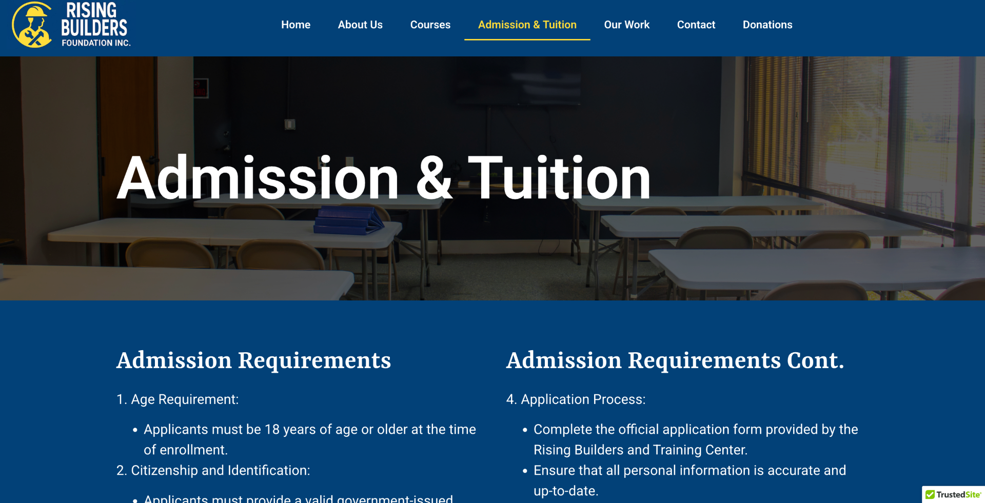
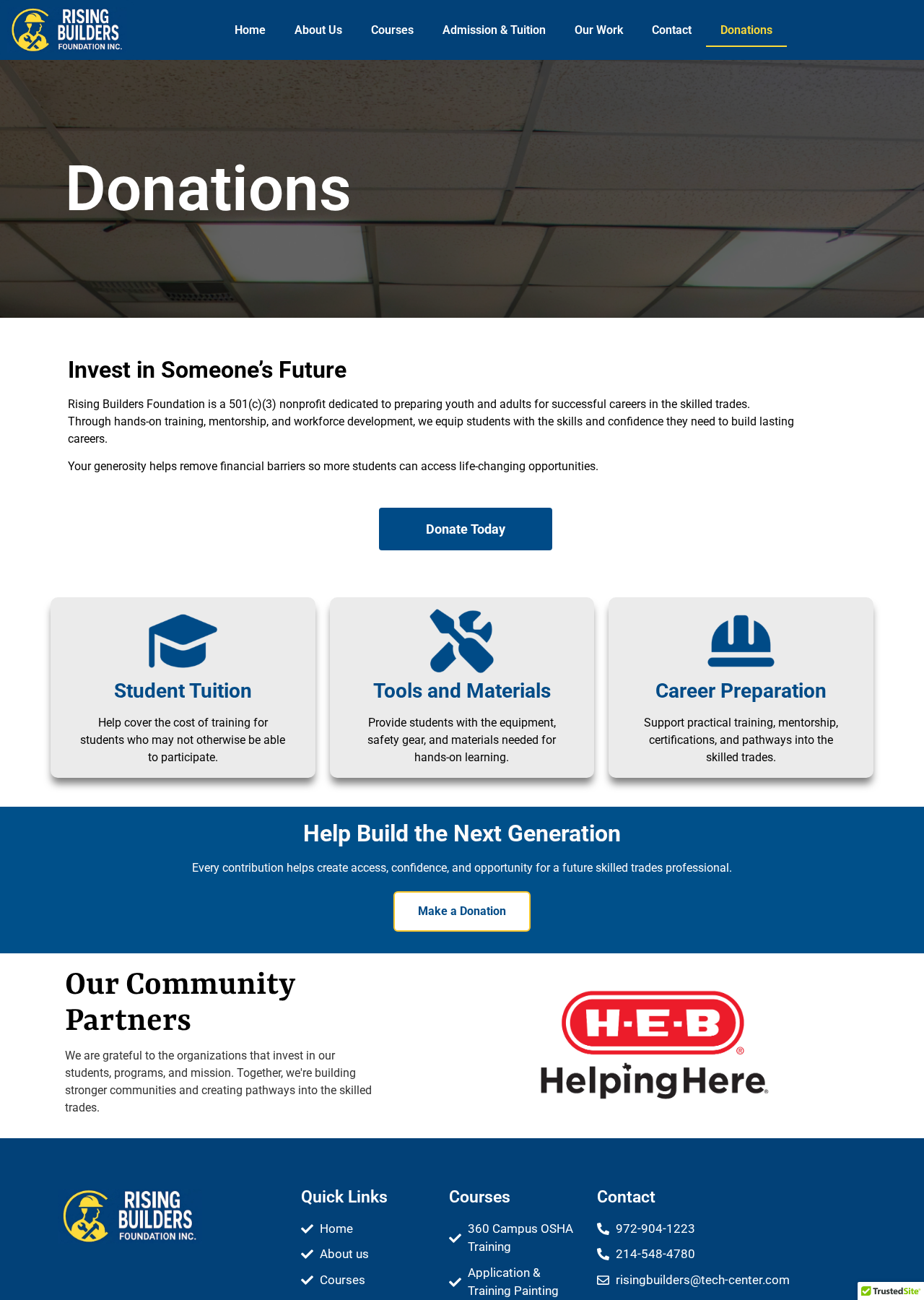
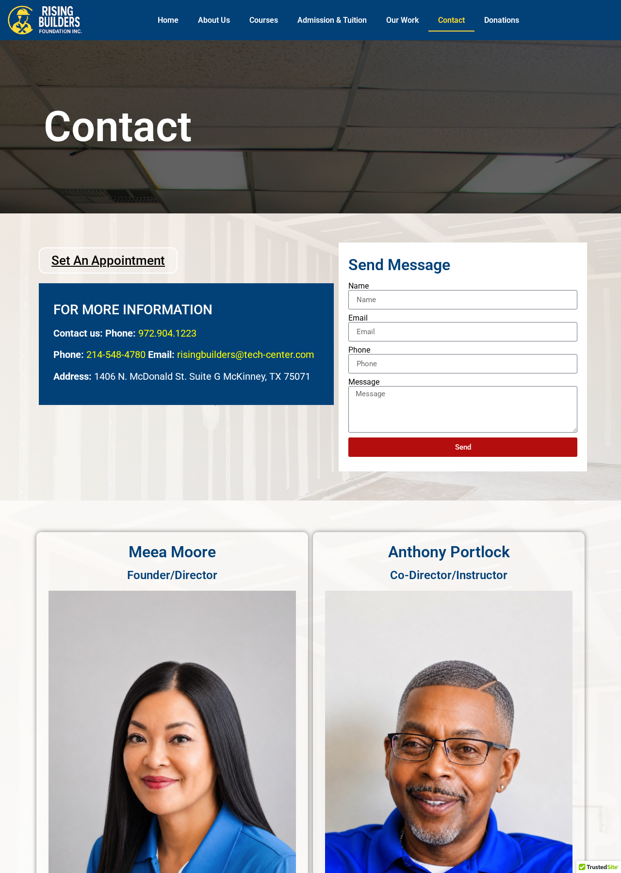
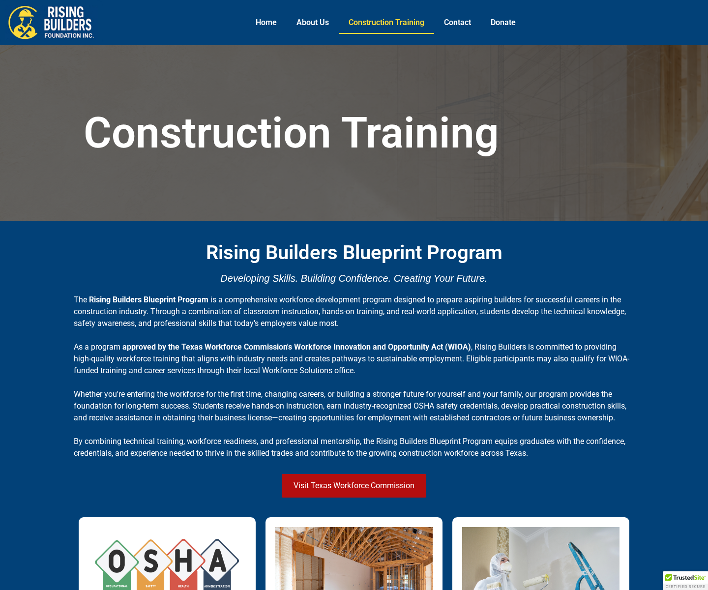
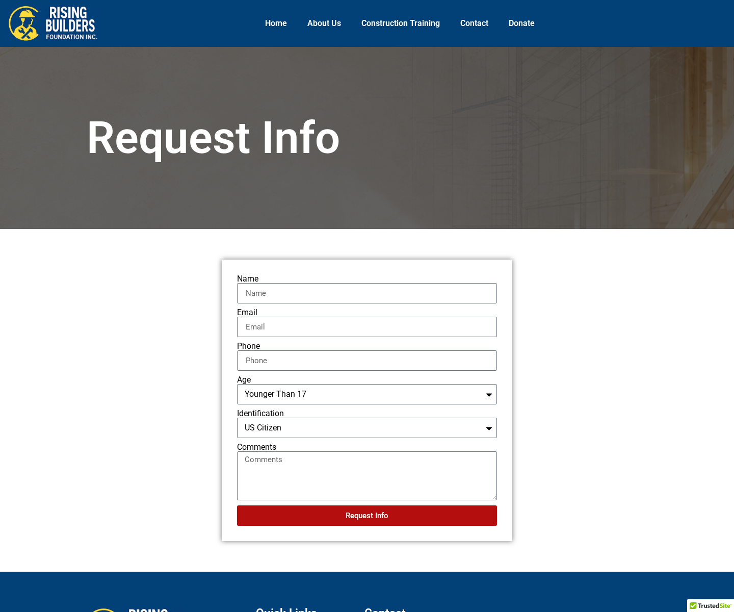
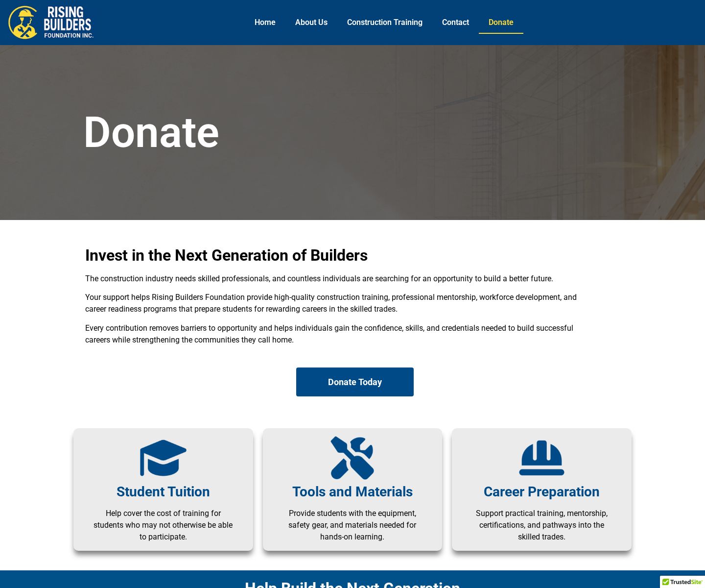
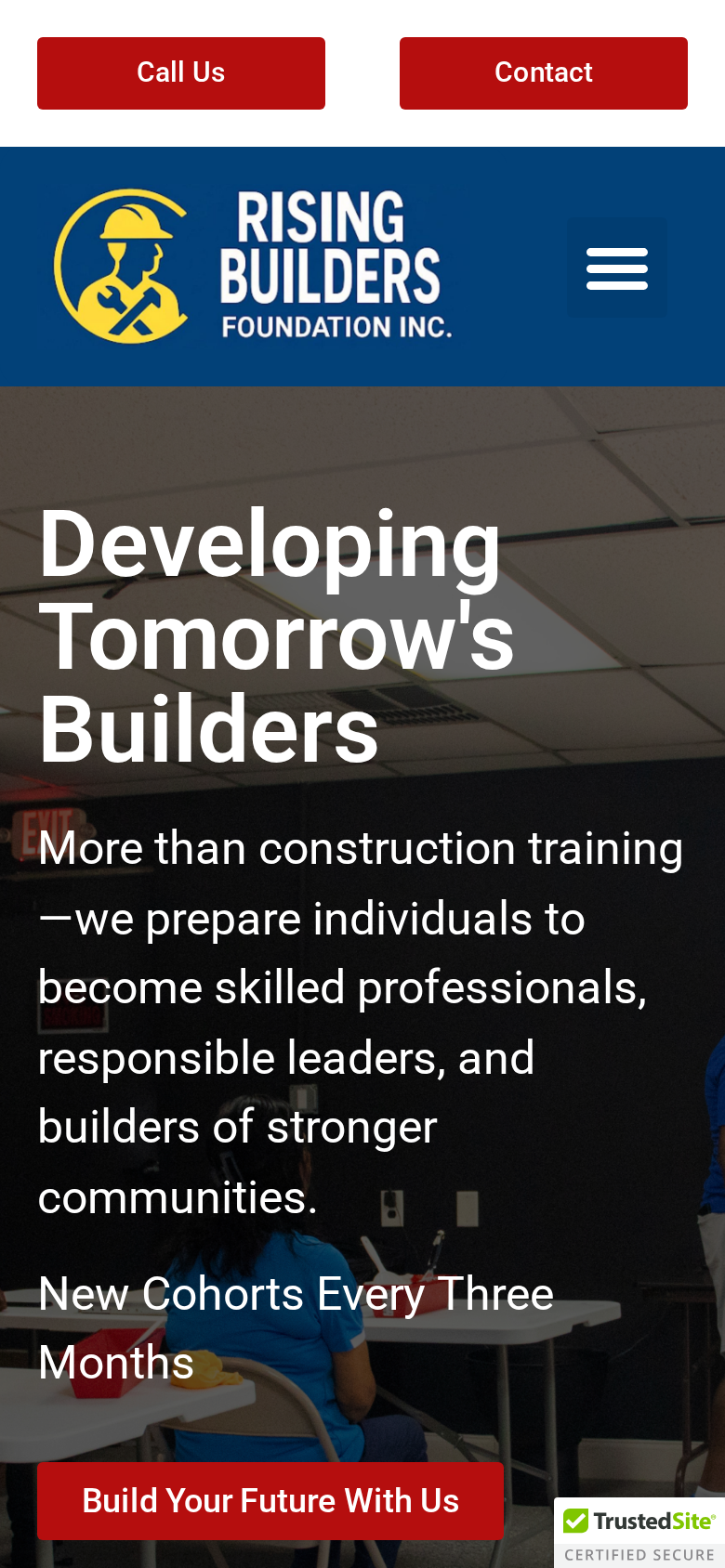
Visitors can more easily locate program, admissions, funding, leadership, contact, and donation information.
Hero sections, images, forms, spacing, and content blocks now display more consistently across smaller screens.
Each page has a clearer purpose, reducing confusion between organizational, program, admissions, and contact information.
WIOA funding and self-pay information are separated so prospective students can better understand their options.
Zeffy is integrated into a more visible and accessible donation pathway.
The website now communicates the organization's mission, programs, and community impact more clearly.
The completed website gives Rising Builders a clearer, more professional, and easier-to-navigate digital presence for prospective students, families, partners, sponsors, donors, and community stakeholders. Visitors can now explore the organization's programs, admissions process, funding options, leadership information, contact resources, and donation opportunities more easily across desktop and mobile devices. The new structure also gives Rising Builders a stronger foundation for future outreach and program growth.
Ongoing social media management, content strategy, and content creation for two connected brands: Kimball Ridge Advisory Services and Candace N. Ford's author platform.
Continue reading